Grid Impact Model Workbook Session Overview
This Grid Impact Model session example shows how a utility user moves through the Excel-based GIM workbook to define EV load forecasting assumptions, apply customer filters, execute a distribution stress analysis, and review service-area, ZIP code, block group, and individual customer 8760 hourly load results.
- Shows how EV, electrification, weather, DSM, DER, and VPP options are specified in the workbook.
- Documents utility-facing dashboards, charts, tables, and block group heat-map outputs.
- Illustrates how localized EV charging loads can create transformer and feeder stress.
- Explains how managed charging, DSM, and VPP scenarios can be evaluated as mitigation options.
Grid Impact Model Sessions
GIM models are designed for in-house utility applications. Model software is encapsulated in an Excel workbook providing easy-to-use option selections and output dashboards, charts, and table presentations. Each model session progresses through three processes:
The example GIM application below illustrates how the workbook supports EV load forecasting, distribution grid stress analysis, customer-segment filtering, and DSM/VPP mitigation analysis.
Example Grid Impact Model Analysis Results and Reports
The GIM model is embedded in an Excel workbook providing easy-to-use option selections, output presentations, and the ability for users to conduct and document their own analysis. This example uses actual utility customer data for two Orlando ZIP codes to illustrate an EV impact analysis application.

BEGIN Tab: Initial Forecast and Analysis Options
The BEGIN tab selects one of two forecast options:
- Distribution System - Small Area Load Analysis
- Extract Individual Customer 8,760 hourly Loads From the GIM Database
Optional forecast options include impacts of:
- EVs
- Demand side management, DER, and VPP programs
- Weather extremes
- Forecast year: current year, 2030, or 2035
The initial selected options in this example are Small Area Load Analysis with Electric Vehicles impacts for the current year customer base. Clicking the "Execute Forecast/Analysis" button transfers control to the EV SETUP tab.

EV SETUP Tab: EV Ownership and Charging Forecast Inputs
The EV SETUP tab specifies the percentage increase in EV ownership beyond the current service area ownership level. The GIM model applies an AI machine-learning kNN model to estimate the probability that each household will own an EV in the future.
Ownership probability varies by income, educational attainment, commuting distance, householder age, and other factors. The model determines which households in the utility service area are most likely to own an EV in order to meet the EV ownership input. Forecast EV ownership varies across service areas and neighborhoods reflecting variations in customer characteristics.

Customer Filter Form: Segment-Level Utility Load Analysis
GIM forecasts can be filtered to focus on customer segments based on income, educational attainment, dwelling unit floor space, and construction year. Customers can also be filtered to include only EV owners or all-electric dwelling units.
Filtering is useful for evaluating hourly load impacts for customer segments that correspond to neighborhoods within ZIP code areas. In this example, no filtering is applied at this point in the forecasting session.
Hourly Load Grid Impact Results Tab
Clicking the "Execute Forecast/Analysis" button presents a form that recaps forecast parameters and, if accepted, continues to execute the Grid Impact Model. In this example, the model provides baseline hourly loads and hourly loads with EV ownership in the two ZIP codes increasing by 15 percentage points above the current level.
Forecast and analysis results presented in the GIM workbook RESULTS tab include results for both the service area and individual ZIP codes.
Service Area Summary Results

The service area summary section provides the following forecast dashboard charts and tables:
- Summary of forecast and analysis options, including the household income filter.
- Average hourly load profiles with and without EV load impacts for selected months.
- Average weekday, peak day, and combined average weekday and peak day presentations.
- Tabular hourly load data corresponding to dashboard charts.
- Baseline and forecast end-use detail for EV, space heat, AC, water heat, appliances/lighting, miscellaneous, and total loads.
- Average weekday kWh, peak day kW, total peak day MW, DSM potential, and annual MWh use.
An additional table summarizes service area customer characteristics including median income, average household members, householder age, educational attainment, commuting miles, square feet, dwelling unit construction year, annual kWh use, and percentage of customers with EVs.
ZIP Code Results

The bottom half of the RESULTS tab worksheet includes ZIP code results. The first section summarizes all ZIP codes in the service area. Data for each ZIP code includes customer count, annual average customer kWh, percentage of customers with EVs, baseline and forecast peak kW for January and August, median income, average educational achievement, year of construction, square feet, average commuter miles, and ZIP name.
In this example, utility customers in the two ZIP codes are significantly different. Median income is $41,000 higher and average educational attainment is 2.2 years greater in ZIP 32806 than in ZIP 32807. These differences account for EV ownership of 23.6% in 32806 versus 10.7% in 32807.
Demand side management potential in the service area and ZIP presentations reflects a relationship between end-use peak day kW and average weekday kW. Percentages reflect the portion of peak kW contribution that can potentially be eliminated with a DSM program.
Block Group Results and Heat Maps
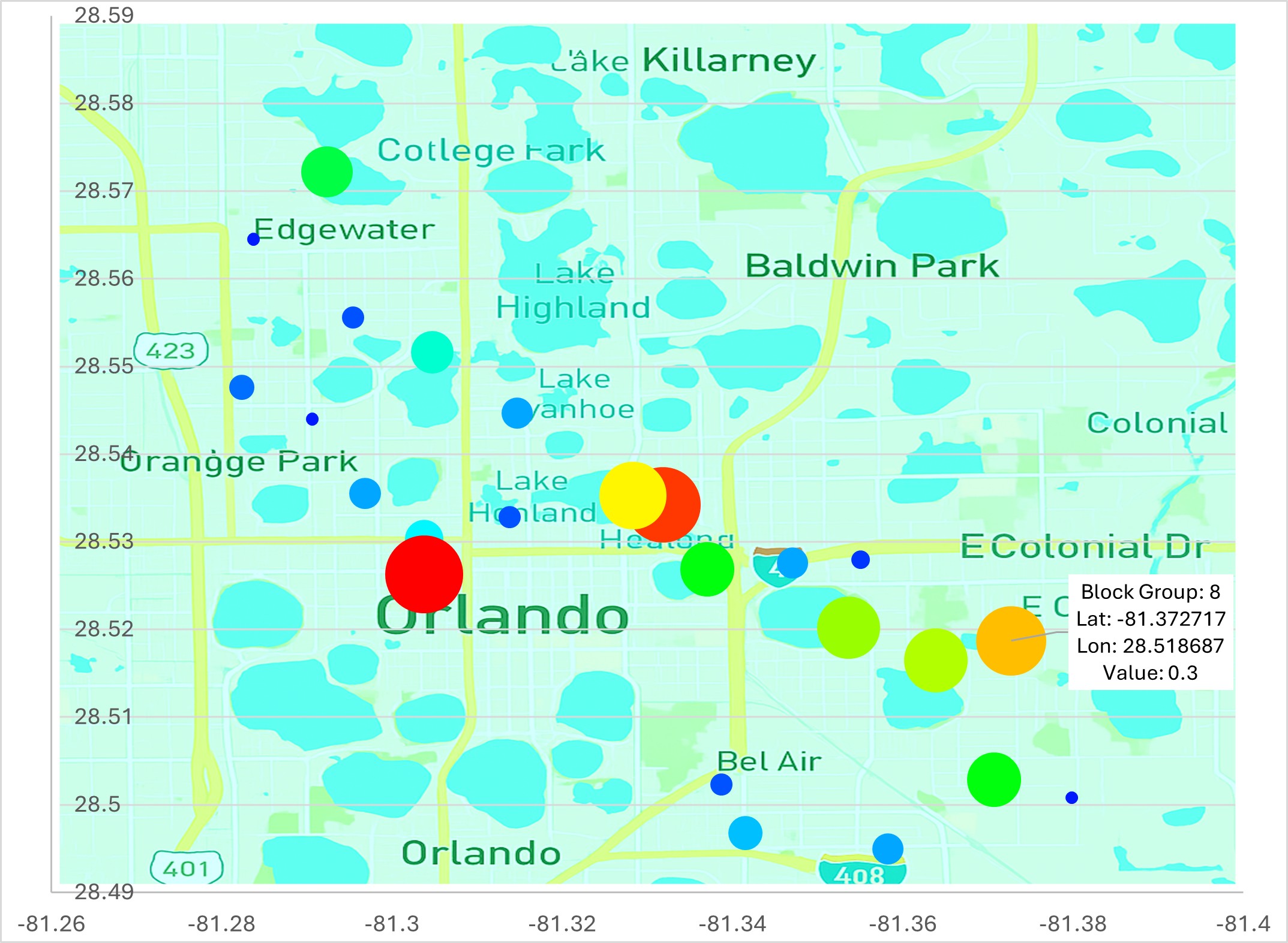
GIM provides analysis results for block groups in the same format as ZIP code results. Tabular data includes one line for each block group. Block groups are Census geographic areas that vary in population size. The demo includes two ZIP code areas with 49 block groups, which is typical for urban areas.
Forecast variables such as EV ownership, EV peak kW contribution, and hours above selected kW thresholds vary widely across block groups. In addition to dashboard results for selected block groups, 20 key variable forecasts are provided as heat maps overlaid on street map backgrounds. The color and circle size reflect variable values, with larger red circles indicating higher values.
Detailed Customer Records and 8,760 Hourly Load Profiles

Returning to the BEGIN tab and selecting "Extract Individual Customer 8,760 hourly Loads From the GIM Database" provides access to individual customer data including demographics, income, dwelling unit characteristics, and 8,760 hourly loads.
This option is especially important for evaluating neighborhoods within ZIP codes. In this example, a high-end neighborhood with household income above $100,000 and households with college degrees was selected. This customer data extraction was used in the online demo viewer presentation.

In the selected high-end neighborhoods, EV ownership is forecast to be 40%. To evaluate the impact on a local feeder branch and transformers, several samples of ten households were exported where four of the households have an EV.
Sample customer charts show the EV charging spike that occurs when commuters return home and plug in Level 2 chargers. Although charger load may be 7 or 8 kW, the total customer load can reach roughly 12 kW when added to normal household load.

While load diversity across ten customers limits the average impact of EV owners, added EV load can still materially increase transformer loading over time and may shorten transformer life, create power quality problems, or contribute to failure.
GIM EV managed charging DSM programs include a time-of-use pricing option and a managed charging option that controls charging times. The time-of-use program can create a charging peak when many EV owners begin charging at the first incentive hour. Managed charging is more effective in shifting charging loads to off-peak hours.
Demand Side Management, DER, and VPP Options
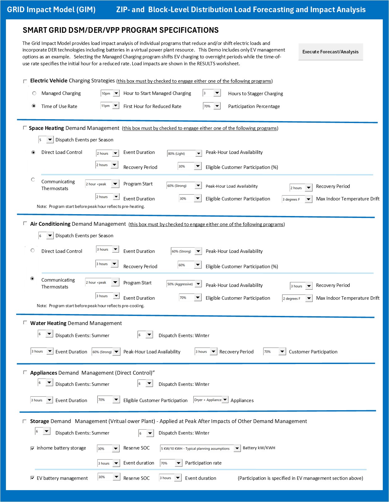
Demand side management and virtual power plant scenarios include:
- Electric vehicle charging: time-of-use rates and managed charging.
- Space heating: preheating, direct load control, and thermostat strategies.
- Air conditioning: precooling, direct load control, and thermostat strategies.
- Water heating: direct load control and thermostat strategies.
- Appliances: dryer and other controllable appliance loads.
- Storage: VPP, home batteries, and EV batteries.
Demand side management programs can be initiated individually or in combination. Program design variables are specified in each end-use section. Programs are dispatched relative to system peaks, with options typical for each end use. For example, air conditioning can be dispatched before the peak hour for precooling, while water heating is typically dispatched at the peak hour.
EV Ownership Forecasting Methodology Summary
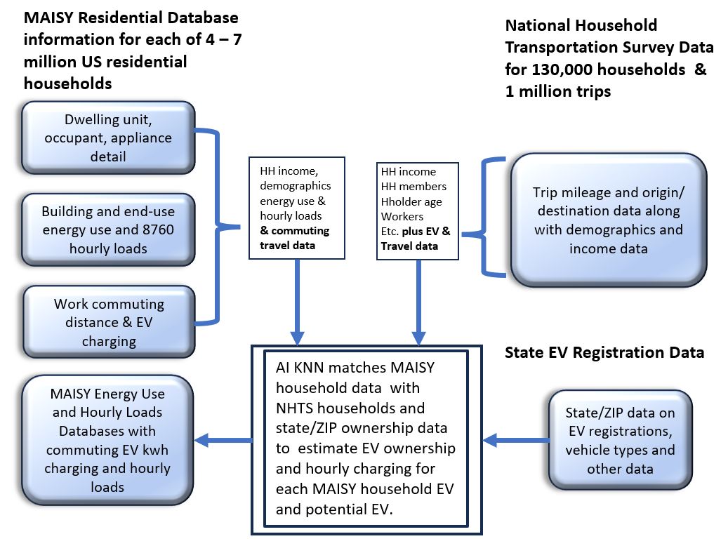
The MAISY AI agent-based model is intuitively appealing: behavior of each household agent in a representative sample of actual households is modeled to forecast the entire population of households. Data on each household is available in the 7+ million household database compiled from the U.S. Census American Community Survey and other sources.
Information on income, demographics, dwelling unit, appliances, commuting characteristics, vehicle ownership, and other characteristics is available for each household record.
An AI process determines the probability of EV ownership for each household in the database. The EV purchase probability is estimated with an AI KNN nearest-neighbor algorithm that draws on a separate household/EV database of more than 26,000 individual households where each record includes income, demographics, other variables, and EV ownership.
The KNN algorithm matches each household with a group of similar households in the household/EV database and calculates an EV ownership probability. More detail on EV ownership and EV charging data development is available on the MAISY EV page.
Additional Model Application Detail
This section summarizes options presented in the GIM SETUP workbook tabs that define each model analysis.
SETUP Tabs
After selecting initial forecast options and clicking the "Execute Forecast/Analysis" button in the BEGIN tab, control is transferred sequentially to individual SETUP worksheet tabs to provide additional parameters for each selected forecast option.
-
Electric vehicle analysis parameters
- Utility-wide forecast year EV saturation increase expressed as percent of households with EVs.
-
Electrification in new and demolished/rebuilt construction
- Allow the model to forecast all-electric dwelling saturation for new construction and rebuilds, or specify the percent saturation of new all-electric customers.
-
Customer growth
- GIM provides 2030 and 2035 forecast horizons. Historical five-year ZIP household growth rates are provided as defaults and can be changed by users.
-
Weather extremes
- Specify percent increases in heating and cooling degree days in the forecast year.
-
Customer segment filtering
- Select customer segments for analysis based on income, dwelling age, and other characteristics.
- Demand management program parameters for selected DSM, DER, managed charging, and VPP options.
Features That Make the Grid Impact Model Unique
- Actual identity-protected utility customer data drawn from the 7+ million household MAISY database.
- AI-assisted customer digital twin modeling process.
- Easy-to-use Excel interface with dashboards, charts, tables, and block-level heat maps.
- Traditional residential load forecasts and forward-year customer growth assumptions.
- Hourly load impacts for EVs, electrification, extreme weather, demand management, DER, and VPP scenarios.
- Service area, ZIP, block group, neighborhood, and customer-level detail.
- Forecast and analysis results that support utility business, investment, and distribution system management decisions.
- Jackson Associates models and data development vetted by more than 150 organizations.
Grid Impact Model Session FAQ
What does the Grid Impact Model session example show?
It shows how a utility user specifies forecast options, EV adoption assumptions, customer filters, and DSM/VPP scenarios inside the Excel workbook and then reviews dashboard results, ZIP-level results, block group heat maps, and detailed customer 8760 load records.
Why is the Excel workbook format useful for utilities?
The Excel interface makes scenario selection, dashboard review, charting, and tabular output accessible to utility planners without requiring custom software workflows for each analysis.
How does the session support transformer and feeder planning?
The session shows how EV growth and customer load changes can be evaluated at ZIP, block group, neighborhood, and individual customer levels, producing outputs that can be mapped to local transformer and feeder risk.
Can the model evaluate mitigation strategies?
Yes. The workbook includes demand side management, managed EV charging, DER, battery storage, and VPP options that can be evaluated individually or in combination.
See advantages of MAISY and GIM data/analysis compared to Department of Energy, NREL, and other engineering model-based sources.